
Back to Our Roots
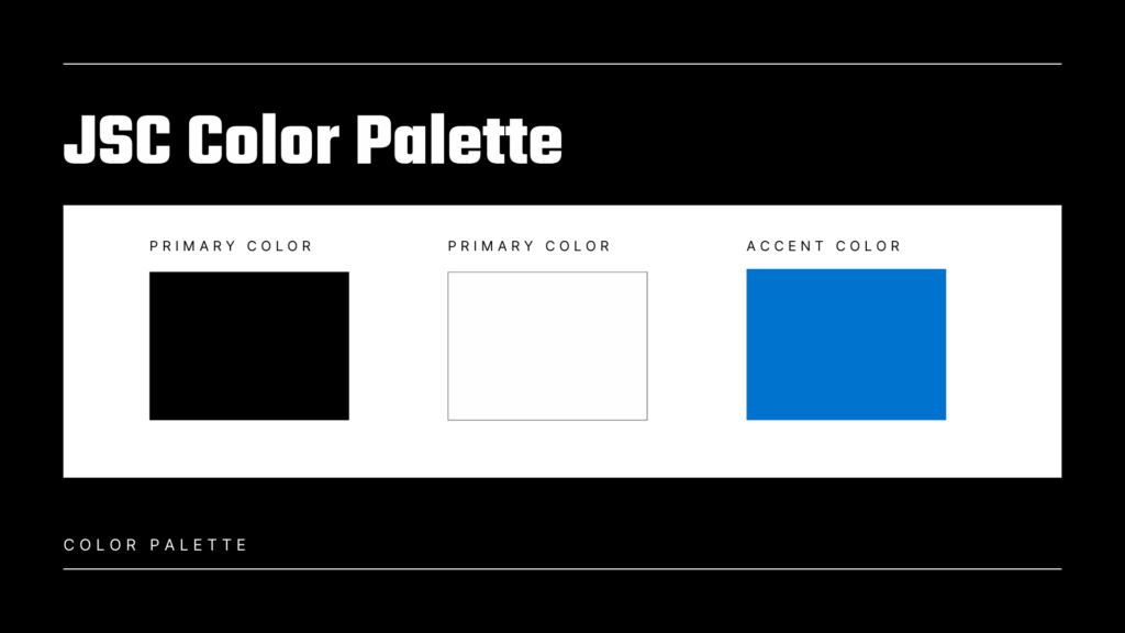
Brand changes are coming to JSC! For the past 7 years we have focused on black and white with an accent of red for our brand colors.
After taking a deep dive into our overall branding we have made the decision to drop the accent of red and replace that with blue. This decision was an easy one as the color blue is associated with trust, credibility & professionalism, all things we strive to be. Additionally, the color blue is a nod to Douglas Sign, Huron Sign and Amor sign acquisitions as blue was incorporated into their branding and historically was a part of ours as well!
Over the course of the next 6 months you will see this roll out to our website, trucks, business materials, and more. We are excited for change and look forward to the future!