Greater Michigan Area (24 locations).
The Challenge
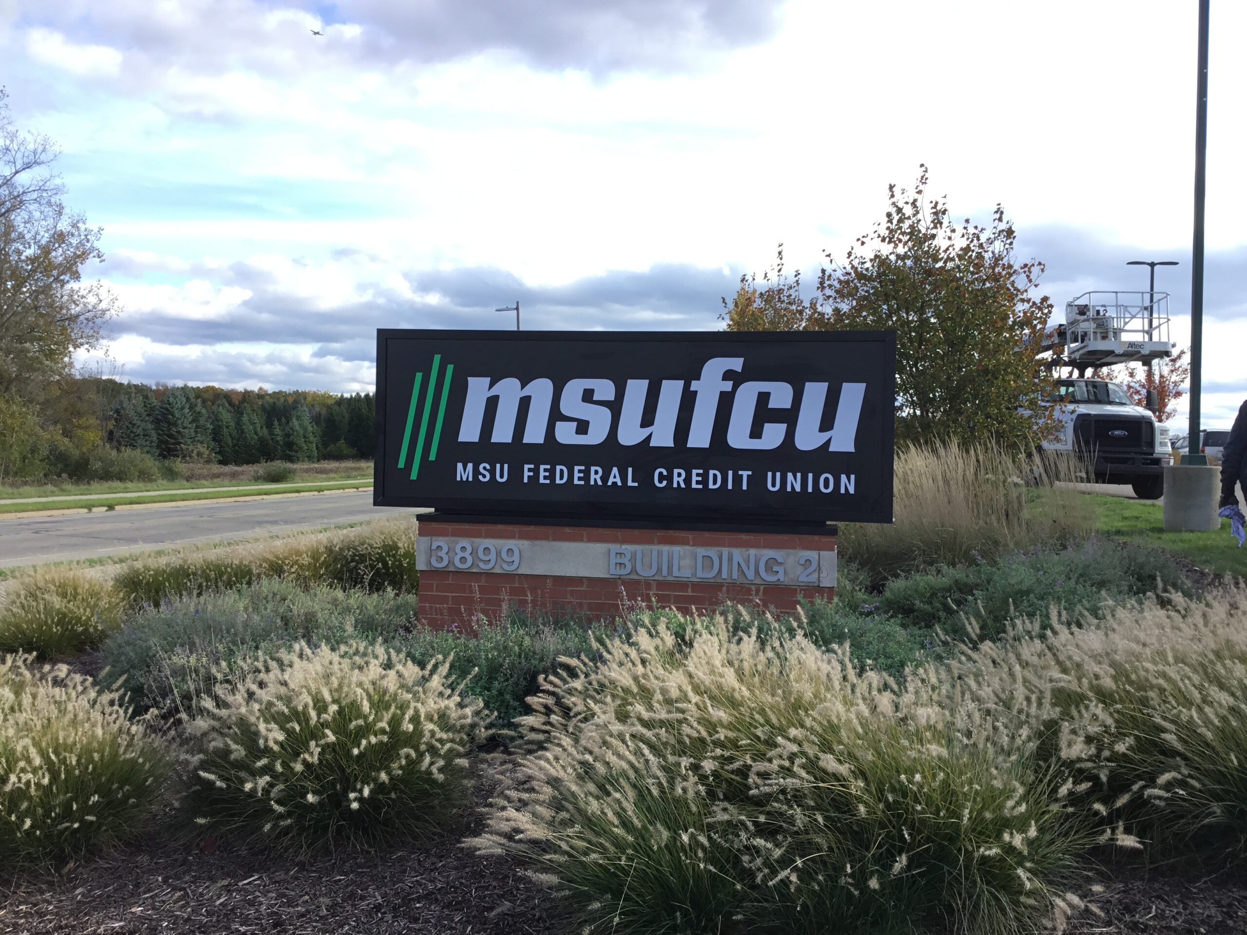
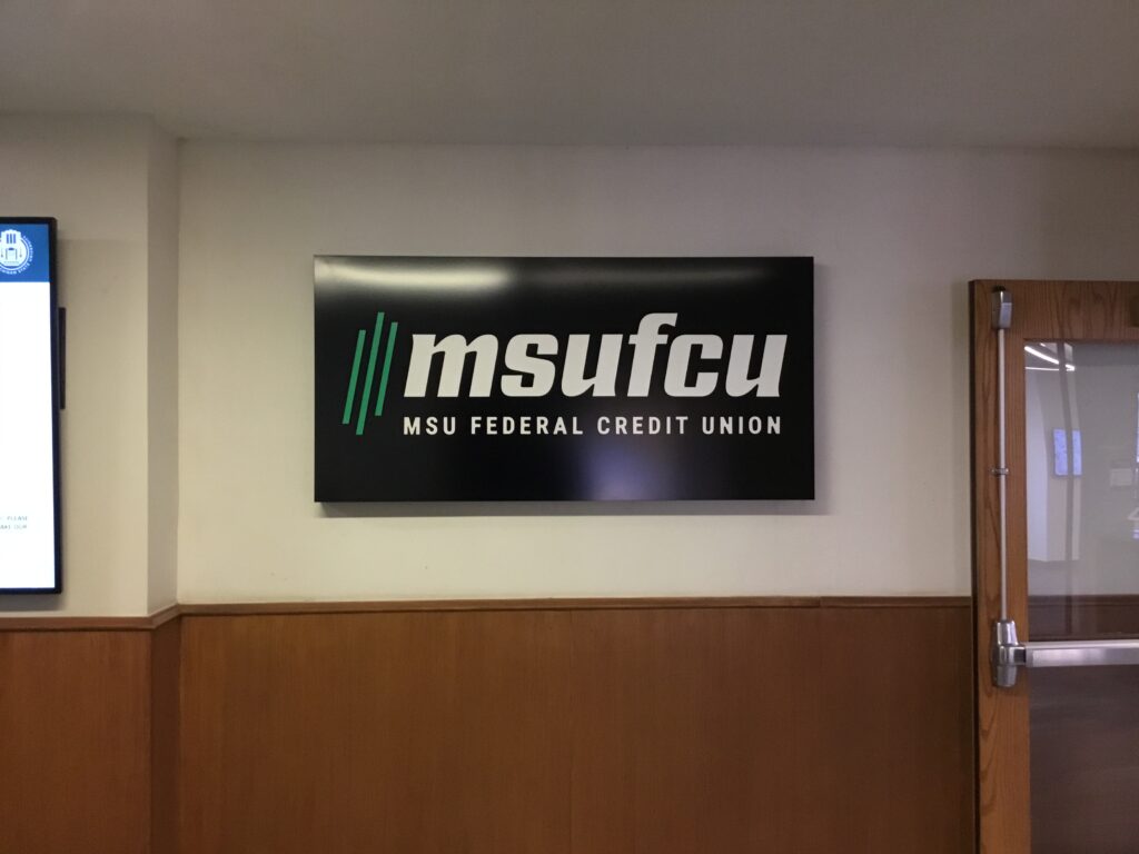
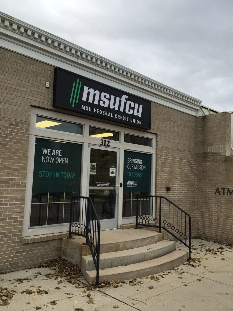
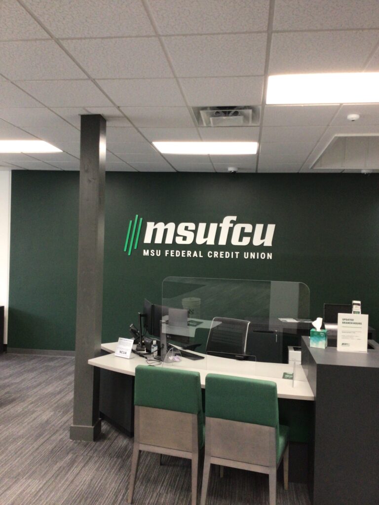
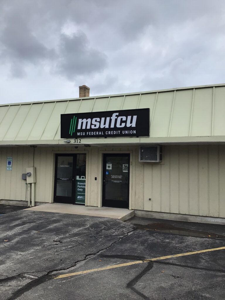
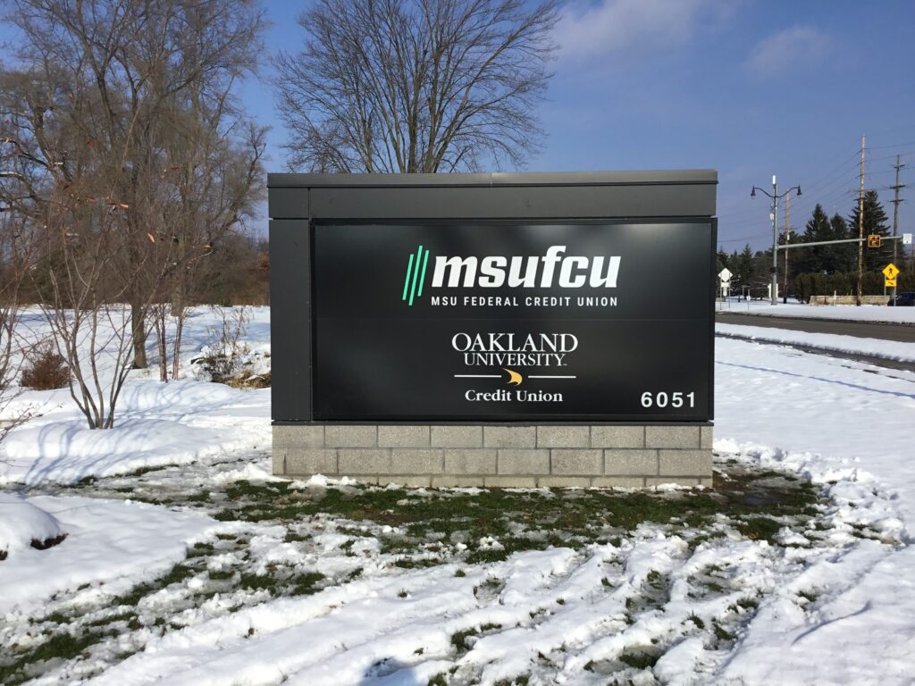
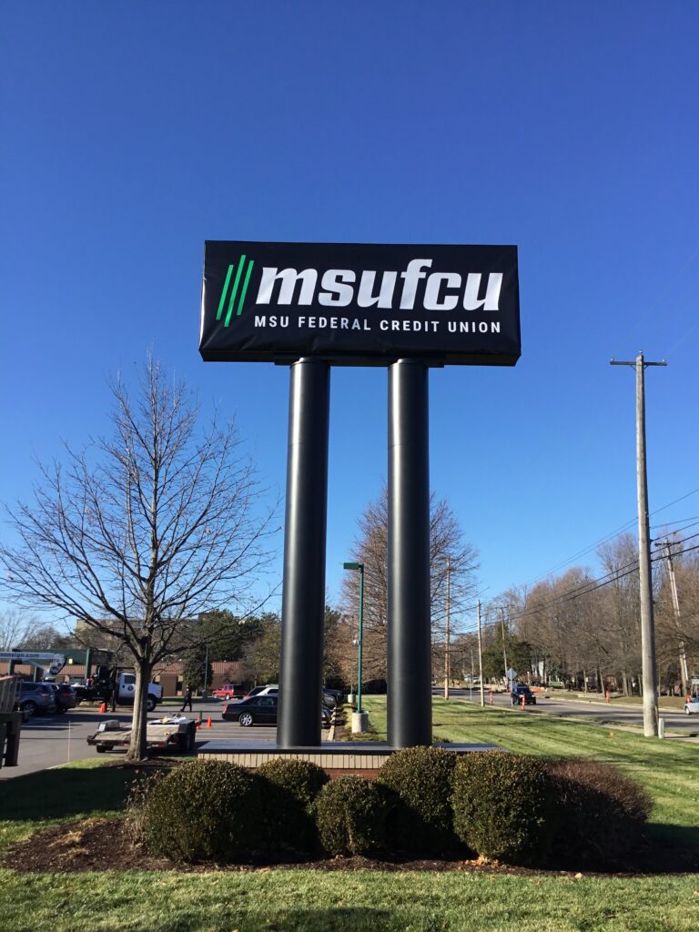
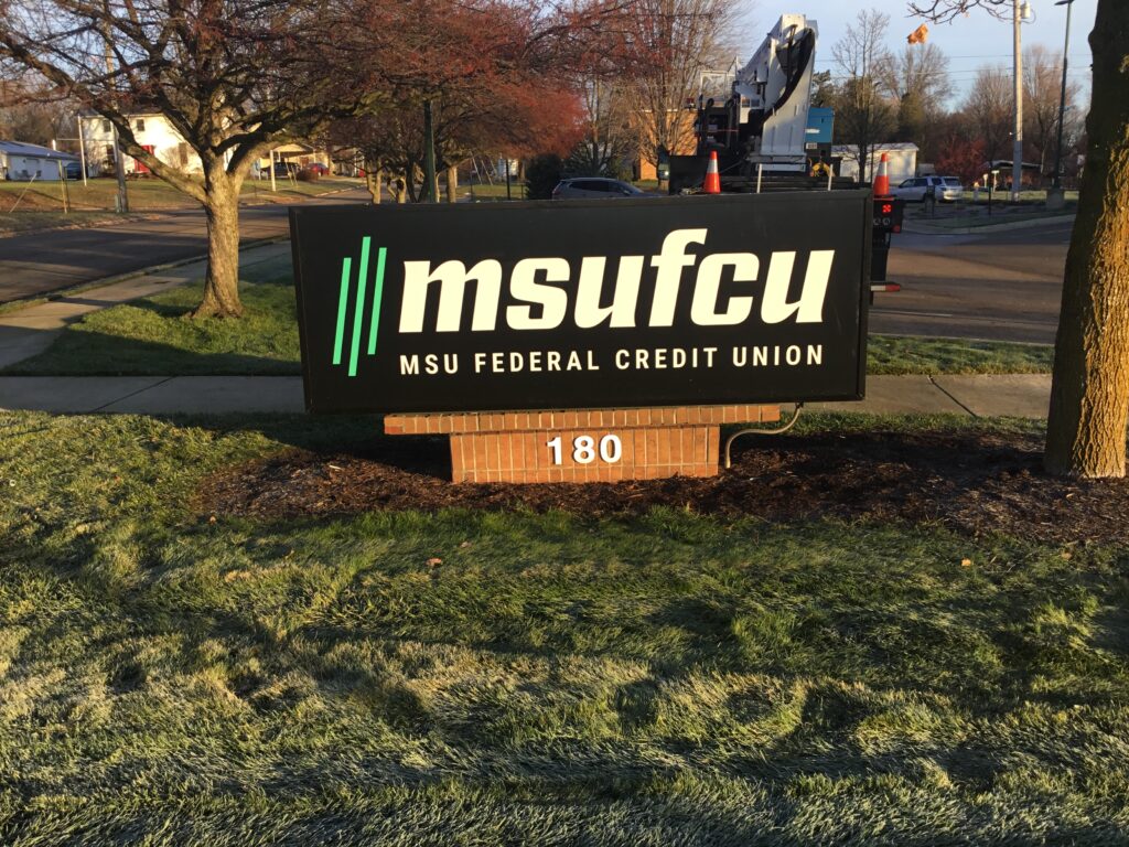
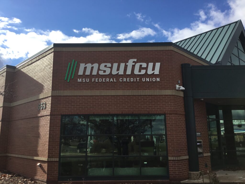
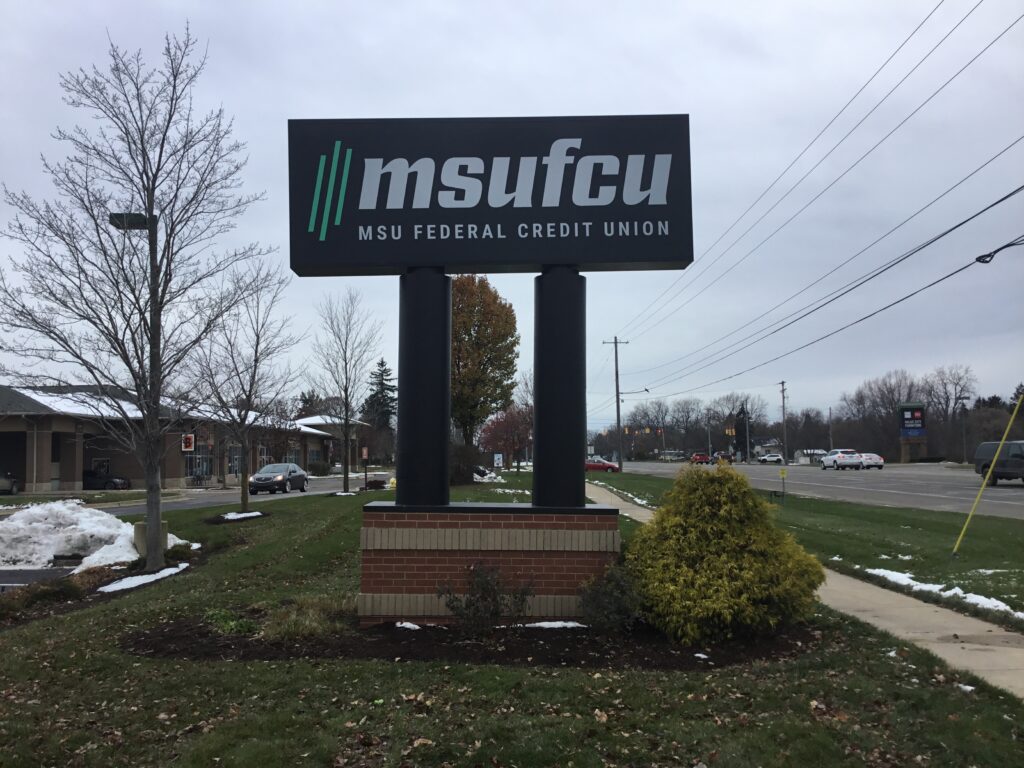
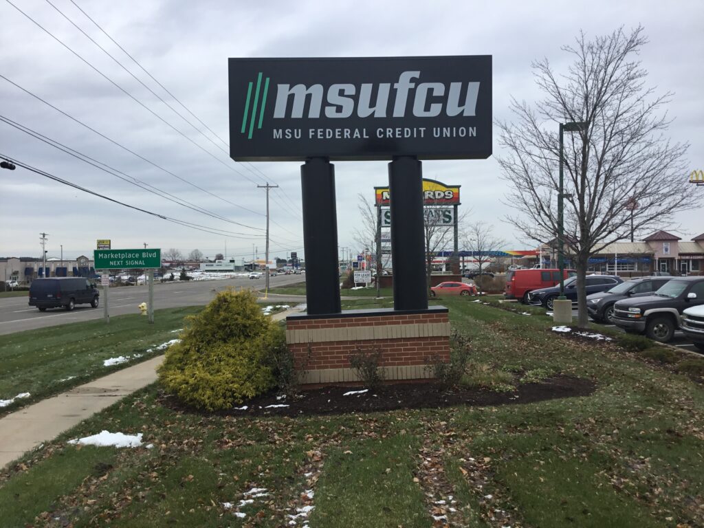
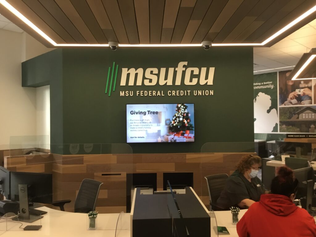
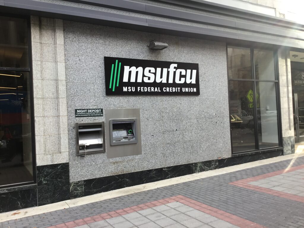
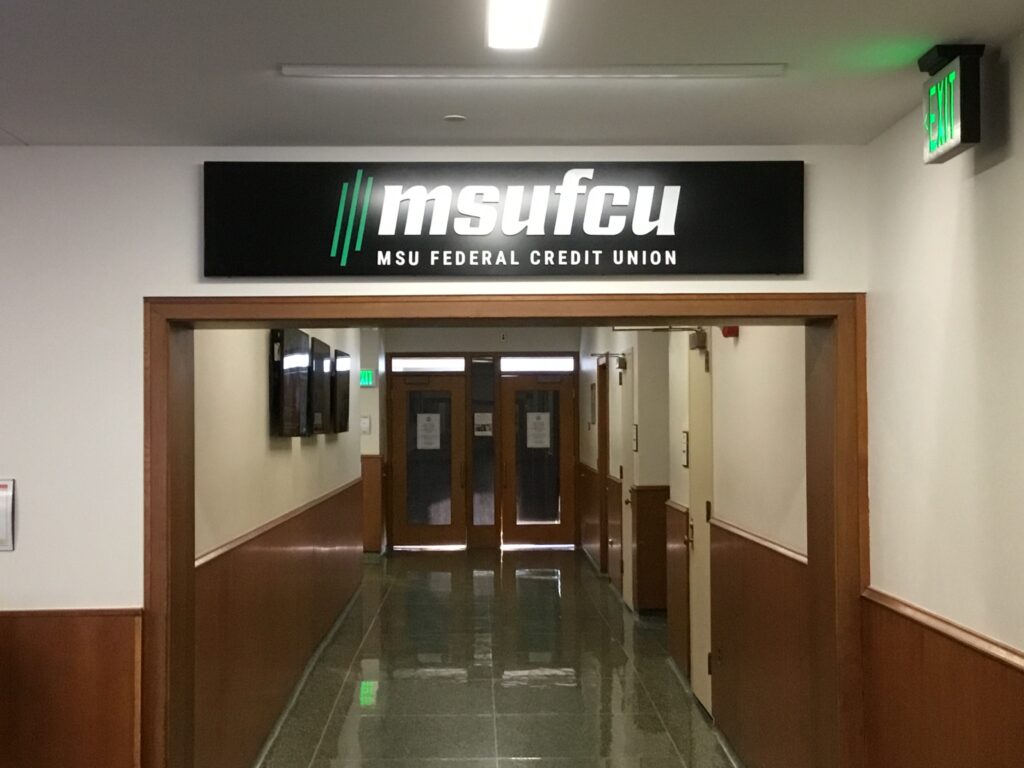
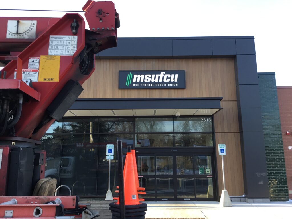
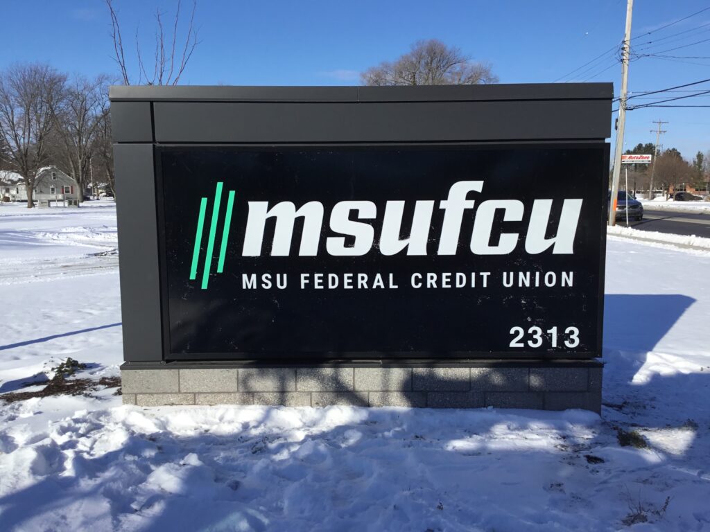
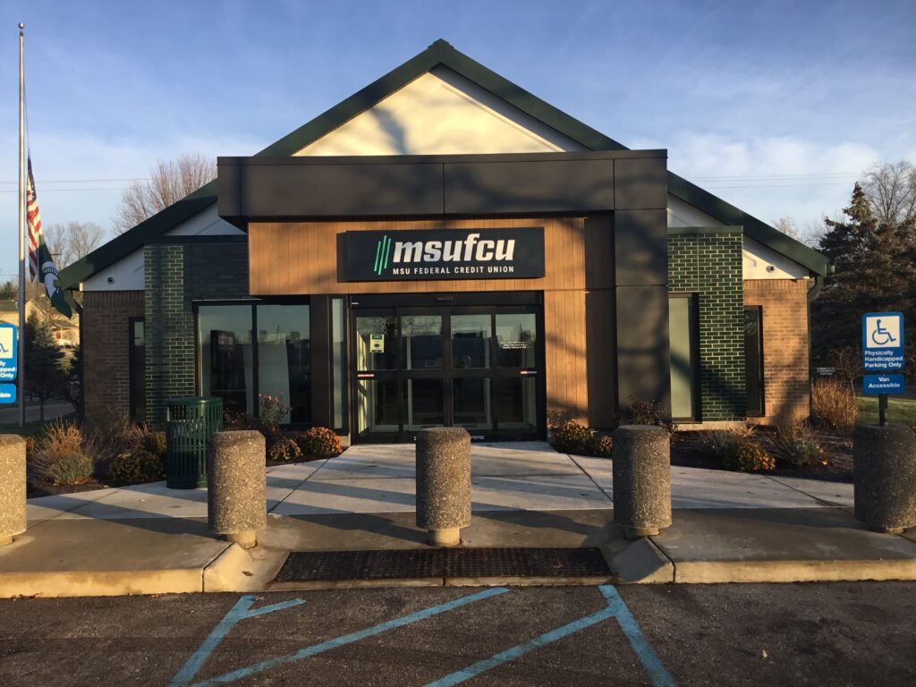
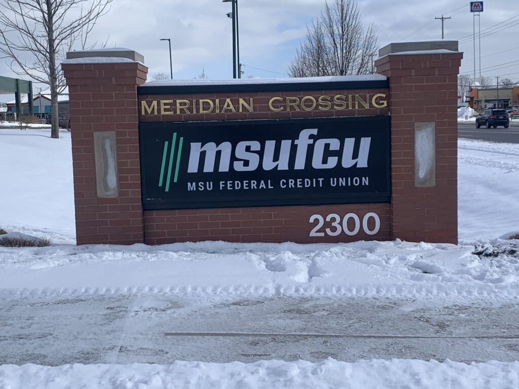
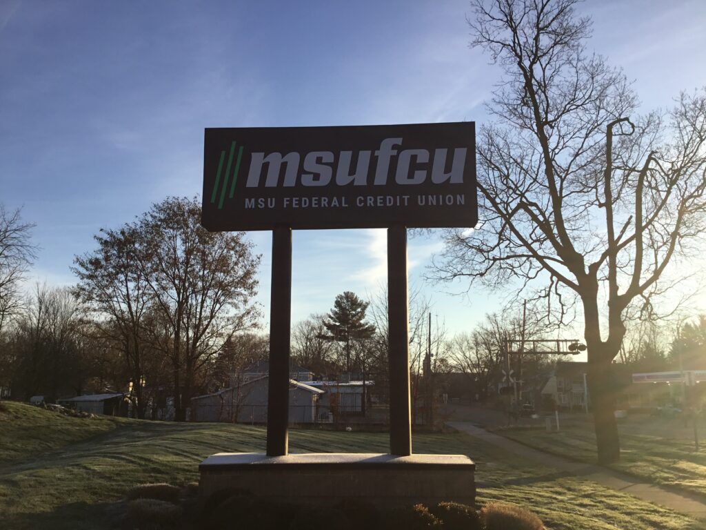
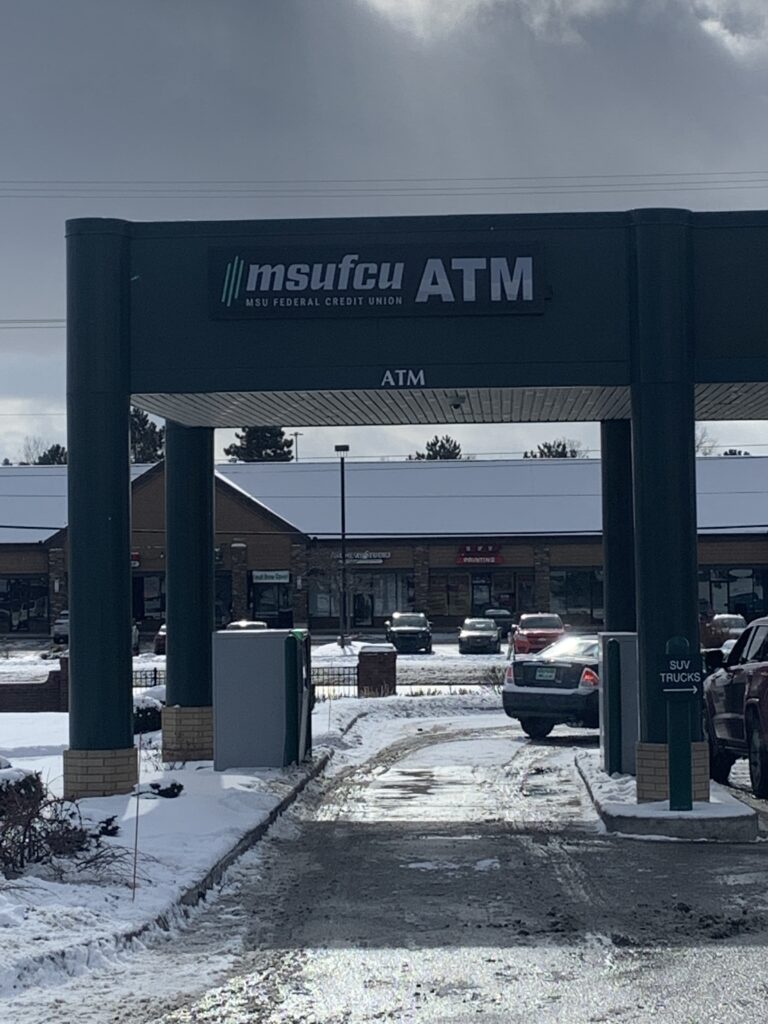
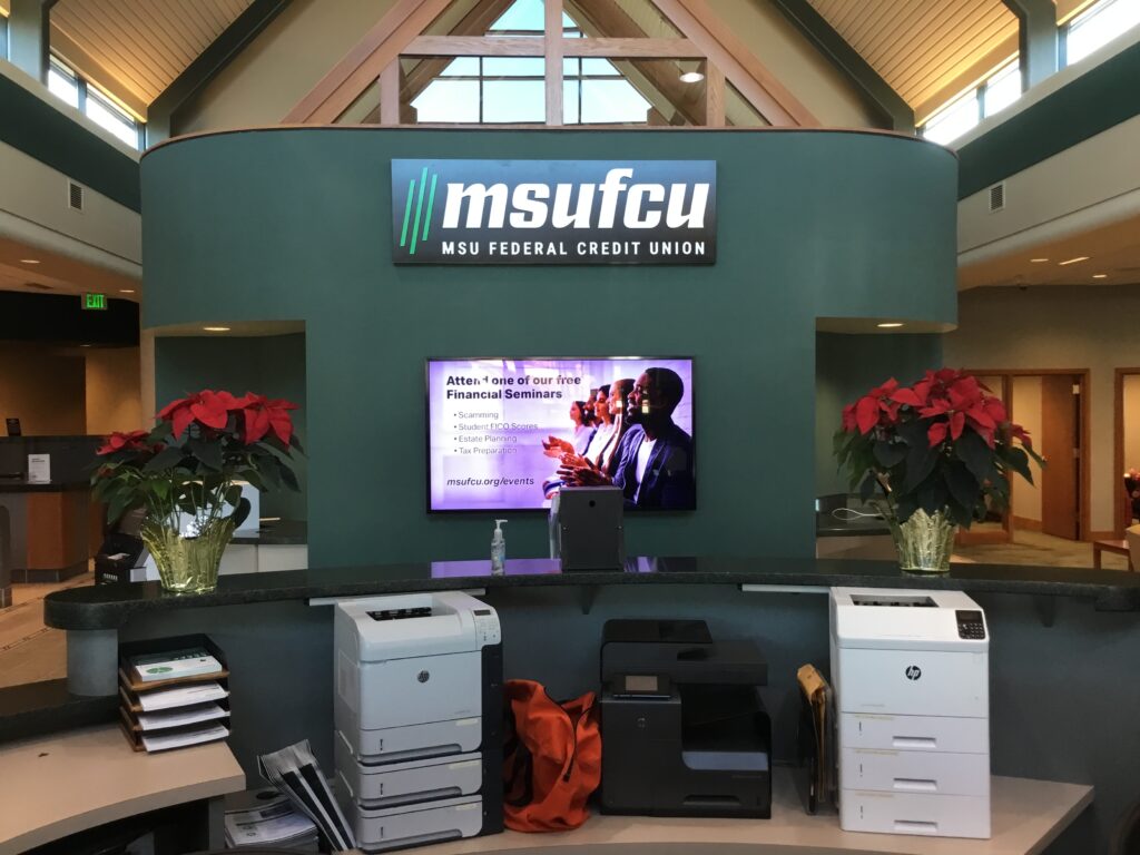
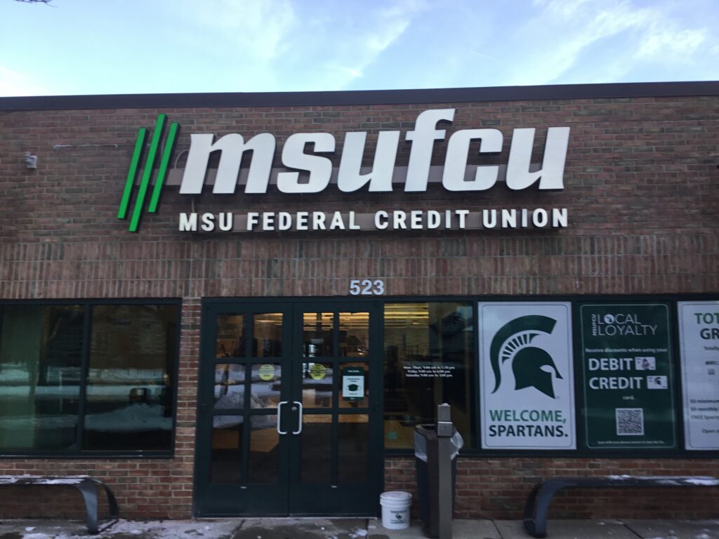
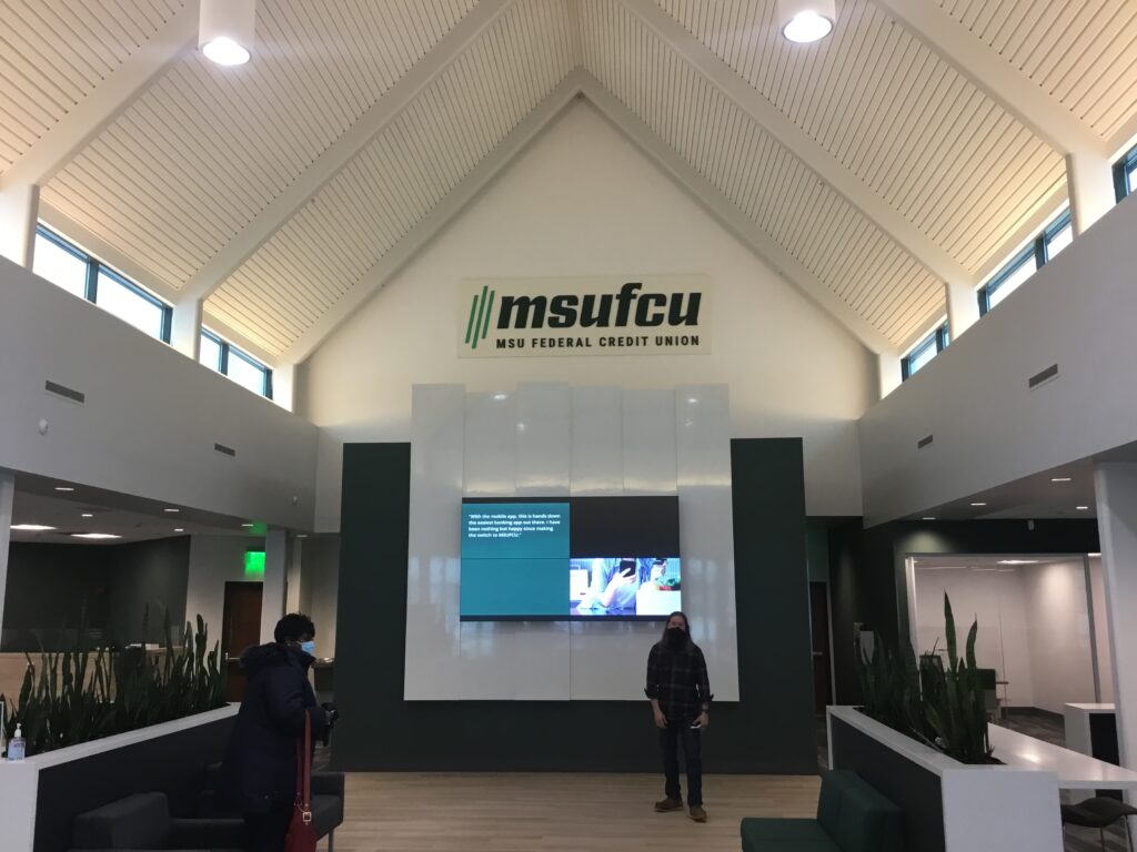
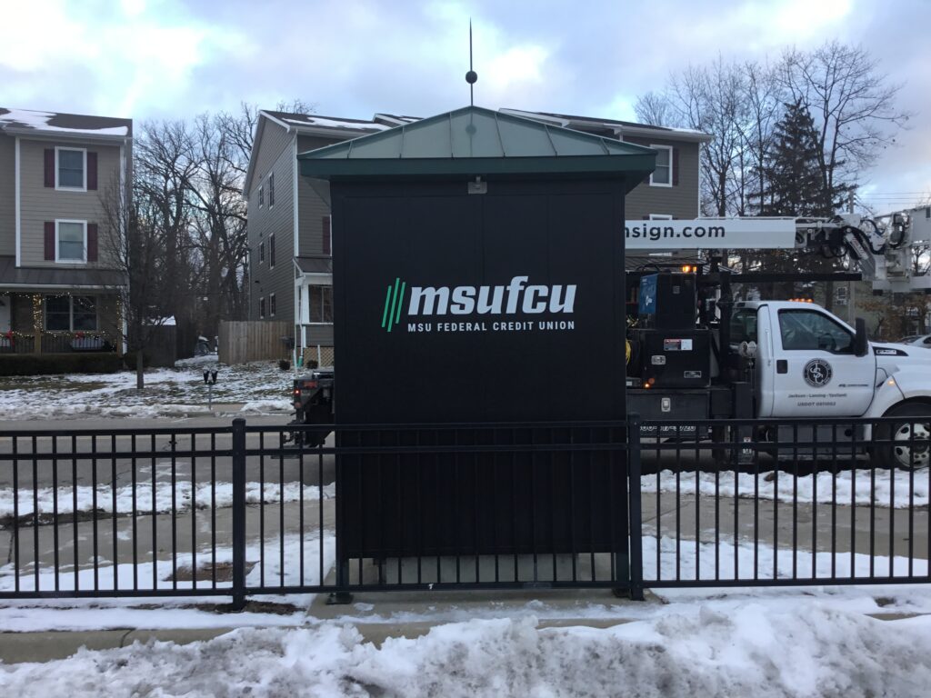
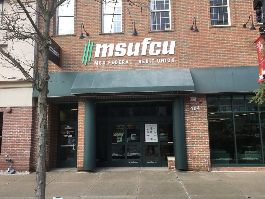
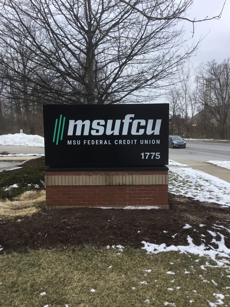
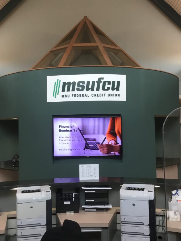
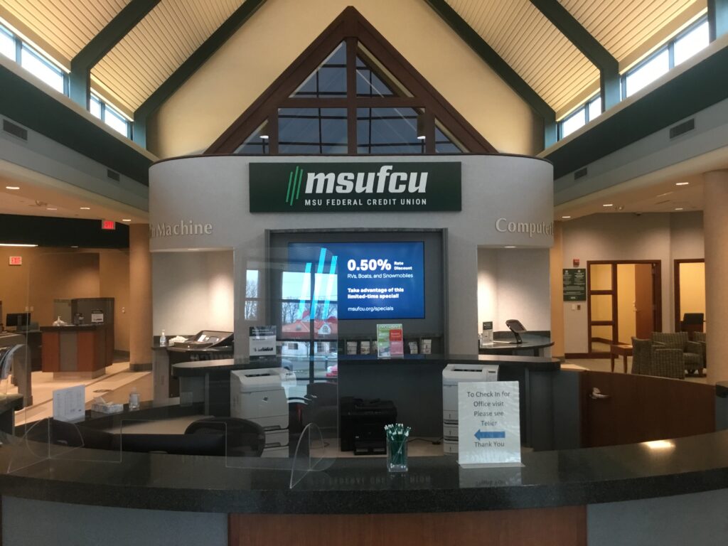
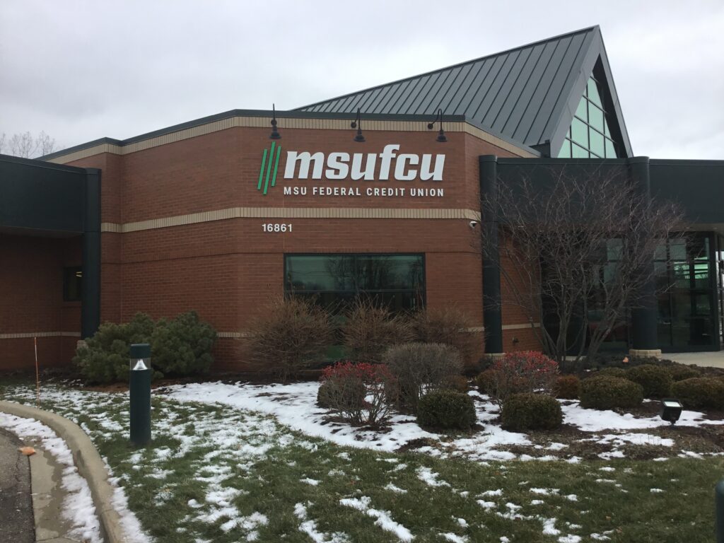
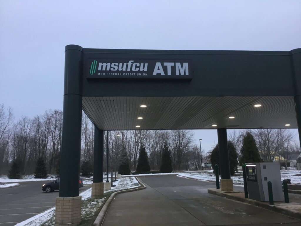
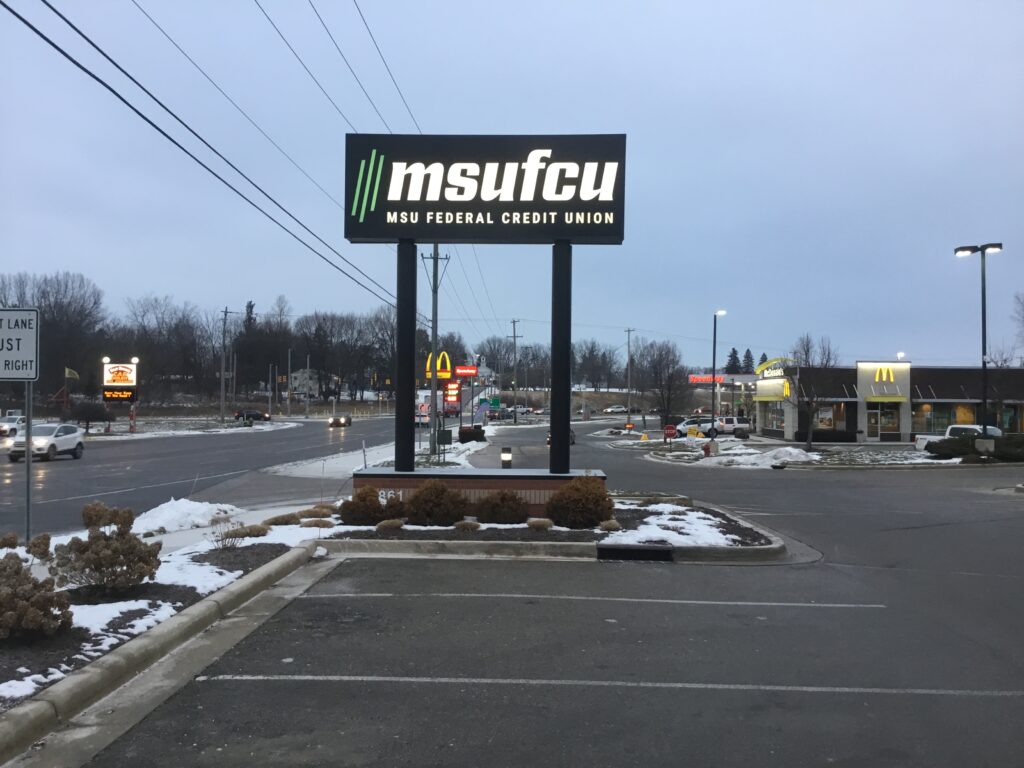
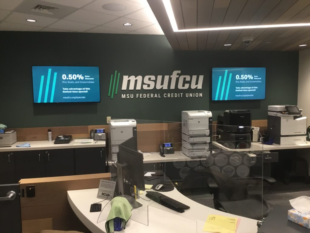
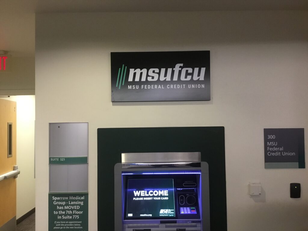
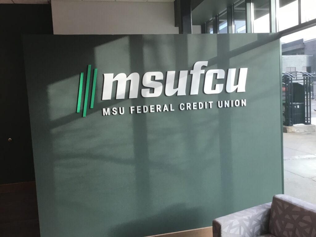
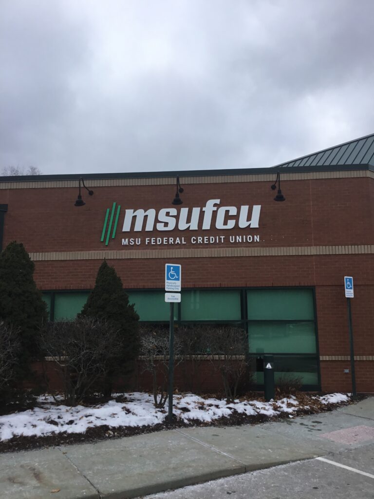
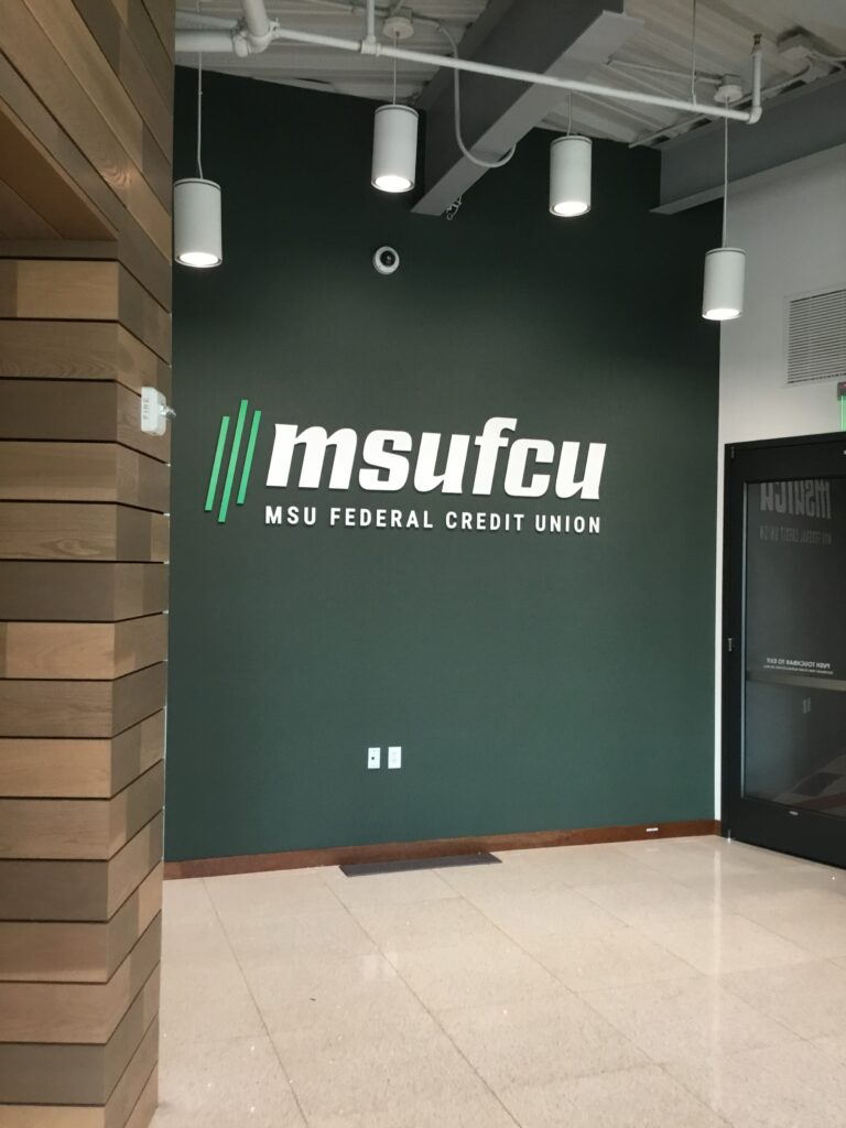
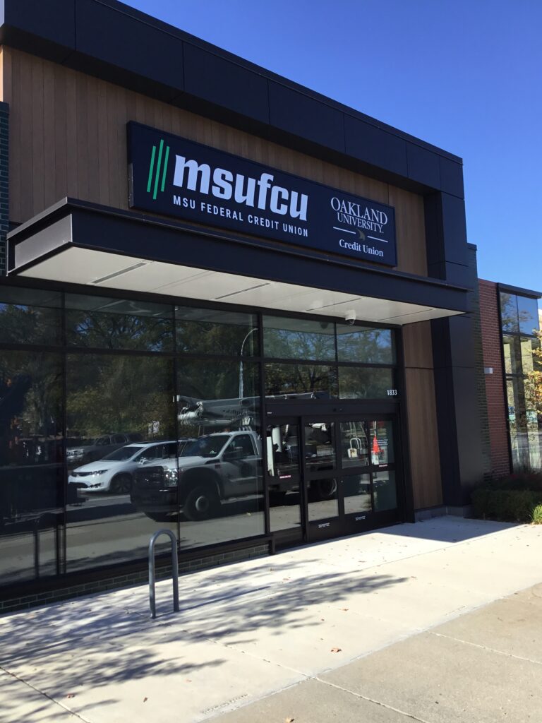
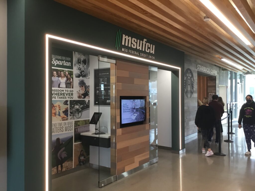
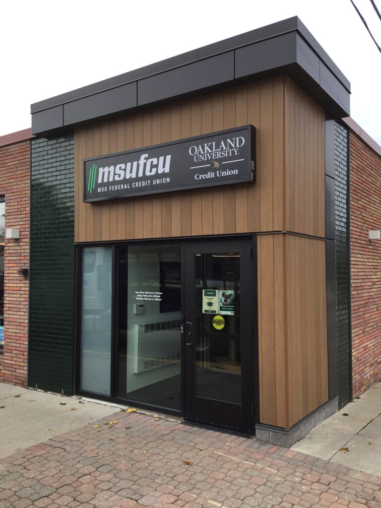
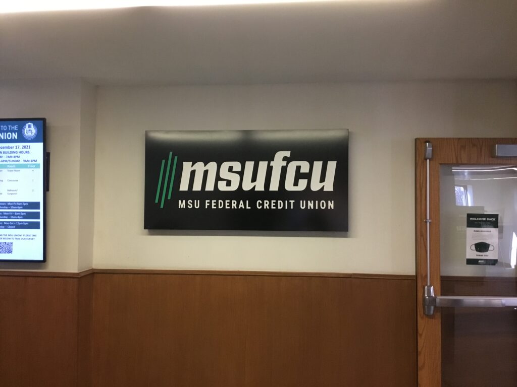
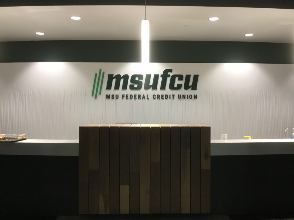
MSUFCU made up of 327,000 members and over 1,000 employees underwent a major rebranding effort that hasn’t happened since the 1970’s. The new logo is designed to honor the Credit Union’s long standing brand with current customers and features three ascending lines, representing their members, employees and community. With such an important milestone for the company and brand, there were high expectations.
The Solution
Over the course of three months and across 24 locations, we manufactured and installed hundreds of different signs made up of interior and exterior. The project included monument signs, pylon signs, wall signs, interior signs, wall letters and banners. With each one of these executions we made it a point to be consistent with how the brand is being represented no matter the sign execution. Throughout the project we recommended refurbishing the existing signs where we could so that it was cost effective for the client.
The Result
The project was successfully manufactured and installed within the outlined timeframe.

More information on the project can be found at the following link: